Embody at Ely Center for Contemporary Art

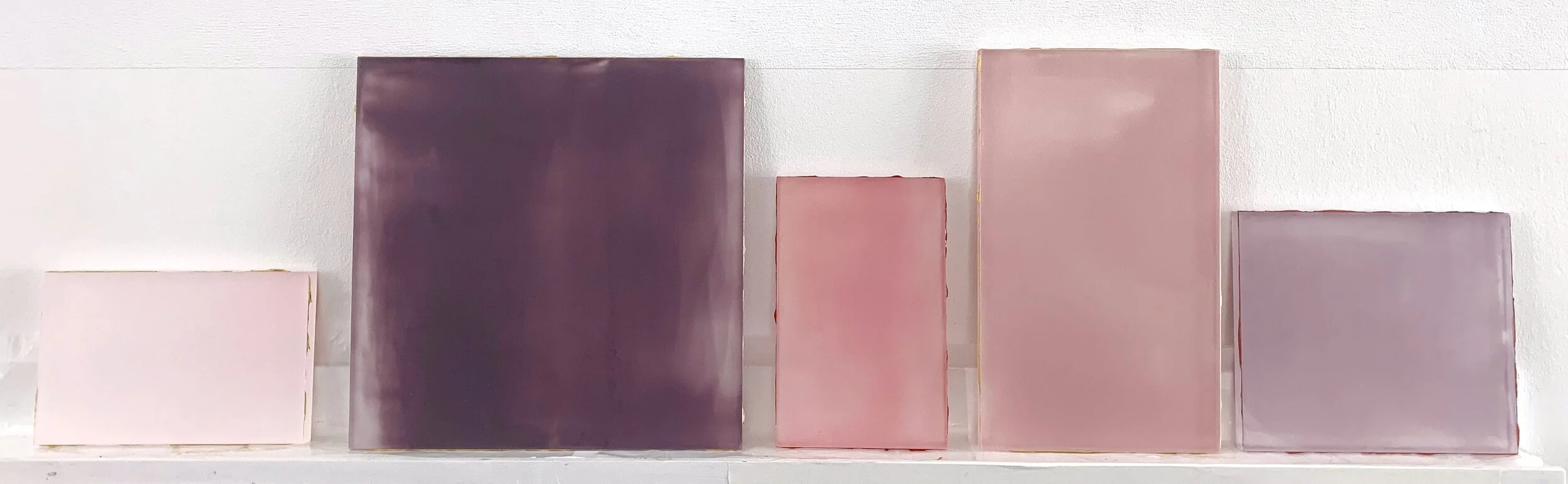
Happy to share a view of 7 paintings from the 50 painting series in A week in Times. Currently part of the exhibition, Embody, at the Ely Center of Contemporary Art, New Haven, CT. Curated by Krista Scenna. Exhibition on view through April 18th.
Curator’s Statement
As I perused hundreds of submissions for what would become the exhibition Embody, it occurred to me that I was essentially viewing living artists' response to our fraught moment. I reviewed the works in early February in preparation for an exhibition in March 2021: the one year anniversary of COVID's known presence here in the United States. So, while this show isn't an exhibition about the pandemic, it is most certainly a reflection of living artists' attempt to grapple with this crisis (and maintain their practice) despite its ongoing repercussions in real time.
The desire for the tangible was resoundingly clear: the impulse to bring the physical into being; to give form to states of being, unsung heroes and unseen actions; and to restore the shapes and bodies that we formerly encountered, touched and experienced with abandon. Embody signals a return to the corporeal in all its fleshy, messy, imprecise and awkward glory. While we are still ensconced in a world dominated by necessary isolation and virtual interactions, these artists labor to remind us that our longing for physicality in real space and time is irrepressible and must be visibly acknowledged.
— Krista Scenna
(de) coding at the Visual Arts Center of New Jersey

I’m delighted to have a selection of paintings from my series, A week in Times, in this group exhibition curated by Mary Birmingham. As Mary states in her exhibition essay, “Each of the works in (de)coding acknowledges or responds to its original source in a particular way. Several redact or obscure information…”
In my series, A week in Times, I am working on a support the size of the front page of The New York Times. Redacting one photo that appeared in this location on the newspaper's front page, I replaced it with a color-field. The colors I’m using in this series were found in the sky at dawn or twilight and then reproduced as paint. The caption from the photo is written along the bottom of the work, where the text would end on the newspaper’s page and is used as the title for each painting. The news stories occurred under these sky colors; it seemed fitting to bring them together.
The Visual Arts Center is in Summit, NJ, and schedules socially distanced appointments for viewing their current exhibitions.
There will be a virtual talk with the curator and artists on April 20th. The exhibition is on view through April 25th.

A collection from the series A week in Times, in situ at (de)coding exhibition at the Visual Arts Center of NJ, photo credit Matthew Deleget. 2021.
A week in Times. Vote.
Chronicling the presidential election from 10.29- 11.8.2020, one painting documented each day through the election period. Each is 22 x 12 inches, acrylic & graphite on resin film. (the size of the front page of the NY Times). I redacted a photo that appeared in this location on the newspaper's front page and replaced it with a color-field. Images of the entire series can be seen here.

VSC2: The Violent Study Club Alumni Association

Breath of Magenta, 8.25 x 7.25 x .75, acrylic on acrylic panel, 2020
Monklike Habits is proud to present VSC2: The Violent Study Club Alumni Association, featuring artwork by Vincent Como, Jonathan Cowen, Matthew Neil Gehring, Rebecca Murtaugh, and Debra Ramsay.
In 2015, The Violent Study Club (part book club, part support group) began as a group of friends who got together to discuss the broad topic of “spirituality in art.” Today, we need our friends more than ever.
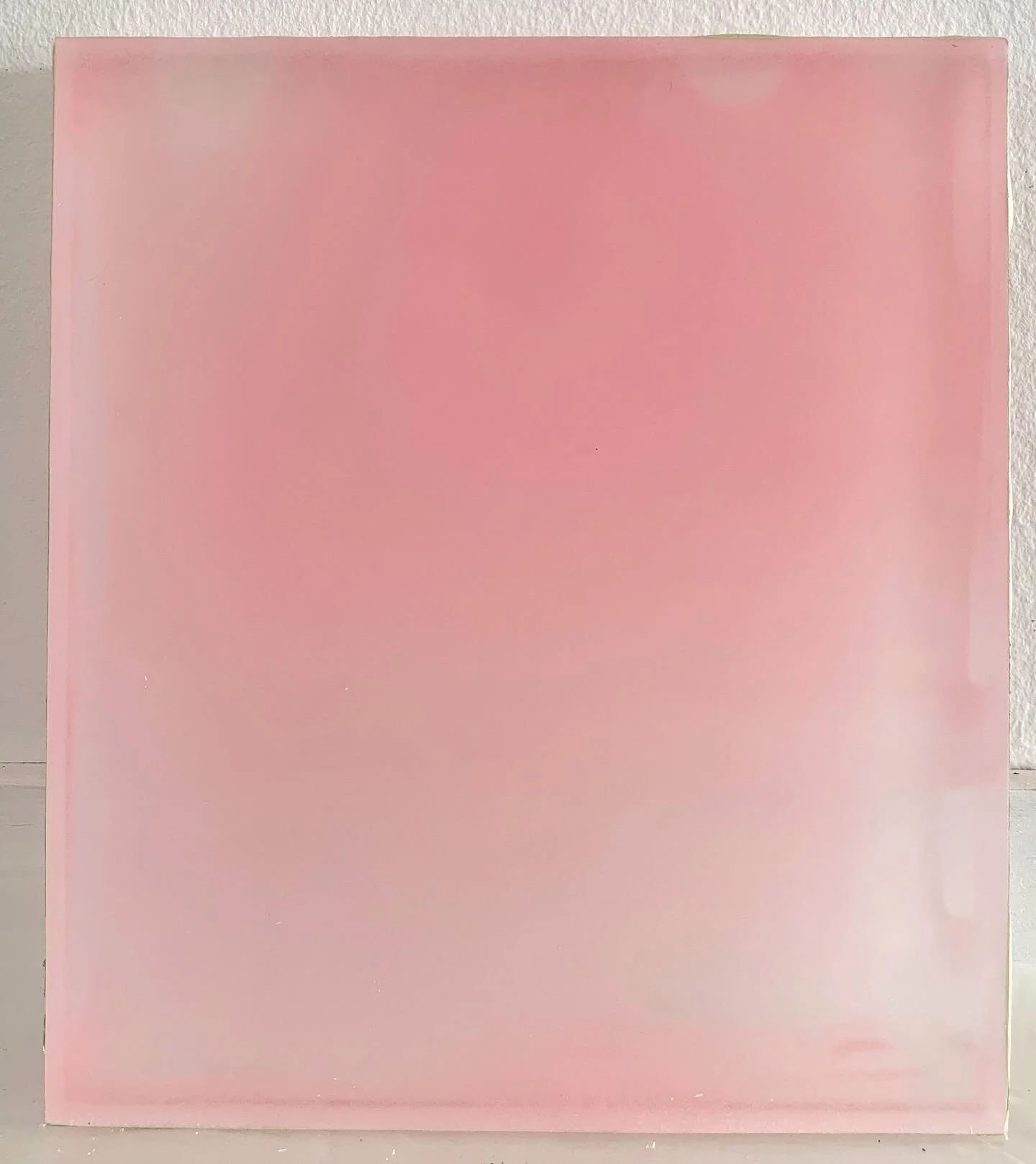
Liminal Space at Bryant Street Gallery

Honeysuckle, 7.5 x 39 x .75 inches, acrylic on cast acrylic, 2016
An exhibition of 4 painters, Gay Patterson, Tracey Adams, Tamar Zinn, and myself, at Bryant Street Gallery, Palo Alto, CA 9/1-30. Honoring the memory of Gay, curated by Tracey.
Saturday's Cloud
I am beyond elated to have my work selected by the Cloud Appreciation Society as the “cloud of the day” they send to their mailing list. The society was founded by Gavin Pretor-Pinney from the United Kingdom, in January 2005. The society aims to foster understanding and appreciation of clouds and has over 50,000 members worldwide from 120 different countries
Here’s their post:

See the actual cloud-a-day email, here.
The Cincinnati Review Spring 2020
I was delighted to accept the invitation to contribute to the visual art feature for the spring 2020 edition of The Cincinnati Review. Below is the video I made to coincide with the publication. Contact me if you’d like to receive a printed copy of the issue.
Mirror/Image Catalog Available
I am honored to have my work included in the catalog Mirror/Image.
Curator Riana Gideon selected 60 artwork images from 200 artists from 26 US states, 70 unique cities, and 20 countries and compiled a catalog of the images. She sent the catalog link to anyone who sent her a screenshot of a donation they had made to a social justice organization. She raised $600. Some of the organizations that she reached include The Marshall Project, Ancient Song Doula Services, Black Women’s Blueprint, Massachusetts Bail Fund, Black Mamas Matter Alliance, Black Lives Matter, and Color of Change.
Here’s a link to the catalog.

The Cincinnati Review, Spring 2020
I am honored to have been invited to be the featured artist for the Spring issue of the Cincinnati Review. In addition to my work on the cover, inside, snuggled amongst great writers, there’s a full-color portfolio of my work. Print copies are available for $10, contact me if you’re interested.

Quarantine, Pandemic of Racism, & Infra (Vapors)
The steadiness of the sky gives me a place to think. That it has been there literally forever (at least in relation to life as we know it) makes it a great landing place for ideas to gestate. It’s steady while being ever changing. As the world attempts to recalibrate and correct from deep-seated racial injustice and COVID-19, the sky continues. The range of colors in the sky that are not blue are of most interest to me now. When taken out of context and used as the subject of a painting, they generate a wordless sense of understanding. We each know this palette, although we might not be able to name why. The colors themselves, in this way, are in kinship with Infrathin, in the ways they are undeniably present yet beyond our full comprehension.
Sky, Vapors. Relationships, 2020

Sky, Vapors, Pink, 8.25 x 5.25 x .75, acrylic on acrylic panel, 2020
Quarantine and Infra series persist
The studio continues to sustain me. I dive deep into this new series, Infra, about sensations that cannot be named, as they are unique (but familiar) and wordless. A little side sprout from this series, Vapors, is growing. It’s all part of the big whole, the pursuit, and study of light and color. Yet Vapors focuses specifically on colors I’ve captured from my digital photographs of the sky. I transform them from the backlit screen of my phone into a mixture of paint (with the aid of a computer program). I use the program to accurately identify the color captured, rather than the color I think I see. The strength of these Vapors is in their pairings. Subtle colors work with/against each other to potentiate the other. There is so much more to explore in these and much to learn. I feel like Linnaeus, who developed the system of plant taxonomy we use today, trying to name all of these colors I find. They are more an example of Infrathin, something that cannot be named.

Sky Vapors 1, Relationship, Infra, 12 x 17 x .75 inches, acrylic on cast acrylic, 2020
Mirror/Image
Mirror/Image is an online virtual exhibition curated by Riana Gideon. I’m delighted to be included in this multi-media project.
With Mirror/Image, the selected works (photography, prints, paintings, drawings, etc.) investigate reflection, meditation, duality, or likeness. Topics explored include family history, personal, identity, current events, societal conventions, and spirituality.
Click here to see Riana’s selection of my work for Mirror/Image.

Form, Color, Relation, #10 acrylic on polyester resin film, approx 9 x 5 x 2 in, 2020
Studio quarantine, some more and introducing Infra*
While recently listening to Kara Swisher interview Tim Ferriss, Tim talked about how quarantine is amplifying all things. He suggested that if you were headed into a sad time, you’d be arriving sooner, or if you were on the edge of a breakthrough, that would show up faster than if we weren’t quarantined. I am finding truth in his idea.
Recently here I introduced some new paintings, themselves a product of the quarantine as I was unable to quickly source needed supplies to continue on a project; thus, substitution was made, failed at original intent, yet revealed something positive.
This work brings together many tests, thoughts, and learned lessons from years in the studio and, as per Tim Ferriss, has come together in an amplified way. The new series, still in its infancy, is called Infra. Infra refers to Infrathin, a concept coined by Marcel Duchamp. Duchamp said the notion was impossible to define, "one can only give examples of it:" I think of it as intangible, yet undeniably present, beyond our full comprehension. Both eternal and ephemeral. Undefinable, ungraspable. Present. InfraThin. Here’s an example I like: “Glass windows, the infrathin separation between inside and out.”
Click here to see the work.

Studio during quarantine, continued
As the quarantine continues, so do I, in my studio. And, as with the uncertainty of this time, so it goes in the studio. My last post reflected on bringing aspects of past work forward. I had a plan. Full stop. I’m thankful for having learned long ago that plans, sometimes, are only the beginning of the journey in the studio. I know to stay open and watchful of things taking a different direction, which brings me to this week’s discoveries that arose out of a shortage of materials and attempting to make a substitution. It didn’t work “as planned” yet brought together aspects of past projects and melded with some new thinking. These pieces are so fresh; they currently don’t have titles. I consider them somewhat ungraspable and ethereal. They appear to behave like solid, gas, and liquid all at the same time; the edges are the center.

Untitled for now, 8.25 x 7.25 x .75 inches, acrylic on acrylic panel, 2020

Untitled, for now, 8.25 x 7.25. x .75 inches, acrylic on acrylic panel, 2020

Studio during quarantine
This period of isolation has encouraged a degree of rewiring of my work habits. It has opened time to ponder, to reach back to previous work, and to bring forward aspects that feel worth further investigation.
2014 was the first time I exhibited artwork that was hung by piercing the actual artwork. I used etymology pins piercing through silk, into another material, so the overall effect was that the pins were stuck into a glass window. (photos below)
I loved this action, and it has returned in bolder ways. There is a work on acrylic sheet in progress in my studio that I have pierced and used a nail as a joiner and hanging device. The nail holds two sheets of acrylic together and attaches them to the wall. In the past, I have hidden the hanging system; now, it is obvious. I like the simplicity and directness of this hanging method, and the tone it sets to work that otherwise is ephemeral.
I pay homage to artists Robert Ryman and Christoper Wilmarth for their investigations using unconventional hanging systems.

Pierced, Blue, 11.25 x 9 inches, acrylic on acrylic sheet, 2020

detail, Seeing Through, Time as Landscape, silk, acrylic, pins, glass, 2014

Seeing Through, Time as Landscape, Hansel & Gretel Picture Garden Pocket Utopia Gallery, Chelsea, NYC 2014
In Praise of Form: Towards a New Post-Humanist Art
I’m honored to have my artwork included as an example for the thesis of Taney Roniger in her current essay, In Praise of Form, published online in Interalia Magazine.
Here’s an excerpt from the article:
“…a post-humanist art would be one of transcendence. For with the thinker that thought itself into the center of the world silenced, we become living organisms again just like all others, participating in, and exquisitely sensitive to, the dynamic flux of the natural world.”
The full article is available here, generously provided without paywall by Interalia:

“The Wind Turning in Circles Invents the Dance,” 2019. Acrylic on acrylic panel, 19″ x 18″.
Opening May 11th
A Clearing : New Work by Sharon Brant & Debra Ramsay
KeyProjects, 4129 41st Street, #2G, Long Island City, NY
opening 3-5
gallery hours Saturday & Sunday through May 26th, 1-6, & by appointment

Graphite Veil 5, 19 x 18 inches, acrylic on acrylic panel, 2018
Upcoming Exhibition: A Clearing: New Work by Sharon Brant and Debra Ramsay
I’m super-excited to be paired with my esteemed colleague Sharon Brant for this exhibition in a wonderfully intimate apartment gallery space.
If you’d like to know a little more about the history of apartment gallery spaces the New York Times recently printed this story on the lineage of these unique spaces.
Mary Oliver
Mary Oliver has passed. I will miss her words. Here is her poem, Praying:
"It doesn’t have to be
the blue iris, it could be
weeds in a vacant lot, or a few
small stones; just
pay attention, then patch
a few words together and don’t try
to make them elaborate, this isn’t
a contest but the doorway
into thanks, and a silence in which
another voice may speak."
Celebration of Color
I'm honored to be included in this excellent examination of the history of color.
Chromatopia: An Illustrated History of Colour by David Coles
Thames and Hudson, Australia
This comprehensive and sensuous book, written by acclaimed paint-maker David Coles, is based on the exhibition of the same name, curated by Coles and Louise Blyton, which took place at Tacit Gallery in Melbourne, 2017. My painting, An Apple in 13 Colors, was included in the show and is in the book.


One can order by sending an email to INFO@CHROMATOPIA.ORG